[Note about tree graphs/maps/diagrams/charts used in this blog post: the best way to understand them is to try them out on Google Charts. They must be called 'tree' graphs because the data they display can also be represented in a tree diagram or organizational chart, in other words, hierarchical data. I think of them as Mondrian graphs, but they have already been named!]
It’s over five years since I wrote a Short History of HIV in Kenya and I have read, written and thought a lot more about the subject than I needed to then for my MA dissertation. So it’s time I updated things a bit, even though a thorough history would be an entire book. Sorry this history is quick and dirty, I don’t have time to do it the justice it deserves. If anyone needs links for any particular claim they will have to get in touch. I’ll try to supply them here at a later date. This is Part I, with Part II coming as soon as I can get around to it.
It’s over five years since I wrote a Short History of HIV in Kenya and I have read, written and thought a lot more about the subject than I needed to then for my MA dissertation. So it’s time I updated things a bit, even though a thorough history would be an entire book. Sorry this history is quick and dirty, I don’t have time to do it the justice it deserves. If anyone needs links for any particular claim they will have to get in touch. I’ll try to supply them here at a later date. This is Part I, with Part II coming as soon as I can get around to it.
The history of Kenya’s HIV epidemic is very different from those of southern African countries, such as Swaziland, Lesotho, South Africa and Botswana, where prevalence is several times that found in East African countries, and where political, social, economic, demographic, industrial, environmental, infrastructural and other factors also differ greatly. Kenya’s epidemic history also differs from those of Namibia, Zambia, Zimbabwe, Mozambique and Malawi. All those southern African countries form the southern African HIV region, with the highest prevalence countries in the world.
Kenya is part of a different HIV region, the east African region, where national prevalence figures are usually below 10%. It just happens to coincide with East Africa as well! Epidemics in the East African region are older than those in the southern region, but they are not as old as those in the west central HIV region. Phylogenetic analysis shows that HIV probably originated in Southern Cameroon in the early 20th century and spent a long time in and around Kinshasa, in DRC. Various HIV (Type 1, Group M) subtypes emerged and some spread to other countries. For example, subtypes A and D, we are told, spread to East Africa in the 1950s and 1960s, respectively, and are still the dominant subtypes there.
Subtype C spread to southern Africa in the 1970s to completely dominate all the southern region epidemics (and Rwanda, although other evidence suggests the epidemic there is older than those in southern Africa, and therefore ‘eastern’). There is very little genetic diversity in the southern region, so the epidemic there is said to be newer than others. In East Africa there is a bit more diversity than in the southern region. But the greatest diversity is found in west central countries, Democratic Republic of Congo, Republic of Congo, Angola, Gabon, Cameroon, etc. There are also distinct West African and North African HIV regions, but I shall limit myself to the East and southern African ones, as I haven’t had the opportunity to study the remaining regions in much detail yet. Suffice to say, prevalence is lowest in North Africa, higher in West Africa and the west central region, higher still in East Africa and highest in southern Africa.
The following tree graph of prevalence in 14 East and southern African countries (percentage of HIV positive people aged 15-49) shows how much variation there is, ranging from less than 5% to over 20%. But all the highest prevalence countries are in the southern region (which makes some people wonder why some of the biggest countries by HIV funding are in East Africa and places other than southern Africa).

This can be compared to a tree graph of the numbers of people living with HIV (PLH) in each country, which also shows a lot of variation. In both graphs the two separate regions are very clear, with prevalence of over 10% in all the southern African countries and over 20% in three of them, and less than 10% in all the East African countries in the prevalence graph. However the graph for PLH shows that South Africa has the biggest epidemic, in fact, the biggest in the world, with over 6 million people living with HIV, more than in the whole of East Africa. It is of note that some of the countries with the highest prevalence have small populations (such as Swaziland, Botswana and Lesotho), and therefore relatively small numbers of PLH. If this graph were to include all countries by PLH, many of the countries below would be squeezed out, with Nigeria, India, the US and several others contributing more than the East Africa region.

These are huge generalizations, and here's another one: HIV has been around for a long time, perhaps a hundred years, and it must have continued spreading from the epicenter (otherwise it would have died out). Sometimes the virus is depicted as a massive ‘explosion’ in the 1980s, but it had probably been spreading, albeit very slowly, in most countries in East and southern Africa for several decades before such explosive outbreaks occurred. Also, when they occurred, they did so in certain parts of countries; prevalence remained low in most parts of most countries, or else the period of very rapid increase occurred later. The tree graph of prevalence by county in Kenya (the percentage of people aged 15-49 infected with HIV), below, will have to serve as an example of a country with high levels of HIV in some areas but low levels in others (similar patterns are clear in many high prevalence countries, but not all).

National prevalence is said to have peaked in the mid 1990s in Kenya, reaching a little over 10% before dropping at the end of the 90s and gradually settling at around half that figure in 2013. Prevalence in Uganda, in contrast, became high in the late 1980s to peak somewhere between 10 and 15% in the early 1990s. Therefore, Uganda’s epidemic is a bit older and a bit more severe than Kenya's. This may be because Uganda is closer to the epicenter of the epidemic, but there are probably also other reasons. Distance from the epicenter alone does not determine the eventual severity of an epidemic (prevalence in most west central African countries is lower than in most East and all southern African countries, for example).
In Kenya death rates probably peaked in the early 2000s. So, working backwards, if prevalence peaked in the mid to late 1990s, incidence (the annual rate of new infections) must have peaked several years before. A peak in the number of new infections would give rise to a peak in death rates about 10 years later, that being the average time someone infected with HIV would survive before dying from some AIDS related illness (and I must emphasize, these figures are rough).
So far, this is about a time that predates mass treatment for HIV. Treatment means that many HIV positive people can live a long time, perhaps as long as HIV negative people. However, few people would have been receiving treatment in African countries before well into the 2000s. The picture of Kenya’s epidemic is still grainy, but it should be clear that HIV spread far and wide over a longer period of time than some accounts suggest, and is probably close to 50 years old in the country (maybe plus or minus 10 years). More importantly, the picture is grainy because national prevalence figures suggest a fairly evenly spread epidemic, with a large sector of the population infected in each administrative or political unit.
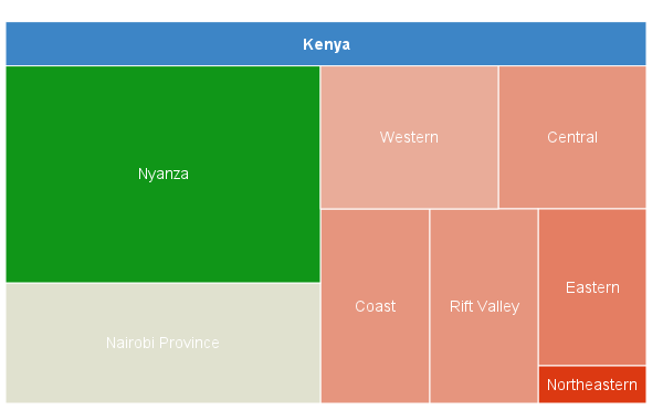
But figures used to create the graph above, released a few months ago, allow us to bring the picture into better focus in Kenya (hopefully). The country recently went through various political changes that have resulted in the generation of prevalence figures for 47 counties, instead of the 8 provinces, which is all that was available previously. A quick look at some of these figures show just how blurred the picture was, for so long! (The graph below is prevalence by Kenyan province, the percentage of people aged 15-49 infected with HIV. If you compare these provincial level figures with the provincial figures for 2003, they are almost identical.)
The last graph is of the five Kenyan counties that border with Lake Victoria. Four of them are in Nyanza province and the fifth is in Western province, on the border with Uganda. Prevalence in Nyanza has remained around 15% for many years, with the highest figures in Homa Bay, Kisumu, Siaya and Migori and low rates in Busia. This graph is of numbers of people living with HIV in each county. But there is quite a range, with over 140,000 in Homa Bay and only 16,000 in Busia. There are more PLHs in Homa Bay than in the whole of Burundi (90,000). Also, there are more HIV positive people in Kenya than there are people in Swaziland.

Because more detailed figures are available now, but figures for earlier periods are hard to find, unreliable and not easy to compare with others, I’m starting the history at the end. How did an epidemic that began so far away, and such a long time ago, come to be as it appears now in Kenya? Prevalence in certain areas is lower than in some US cities. But in other areas it is as high as the three countries with ‘hyperendemic’ HIV, at well over 20% prevalence (Swaziland, Lesotho and Botswana).
The HIV industry that has developed around this lucrative disease continues to insist that the virus is transmitted almost entirely through heterosexual sex in African countries. This is despite the fact that it is mostly transmitted among men who have sex with men in the US (which has the highest number of people living with HIV outside of sub-Saharan Africa), injection drug being use a somewhat distant second mode of transmission in most western countries. Prevalence is low, even very low, among heterosexuals in most countries in the world, so why would it be high in certain parts of certain African countries? This is the central question for me. I believe that a history of the epidemic in Kenya will shed some light on how the virus infected, and continues to infect, so many people in some places and far fewer in others.


No comments:
Post a Comment